

Thyme: eating healthier one recipe at a time
Eating healthy can be a struggle for busy teens and college students, Thyme is a cooking app that is designed as a way for teens and college-aged young adults to discover and learn how to make delicious, quick & easy, healthy meals.
Solo Project
Responsibilities:
User Research & Testing
Wireframing & Prototyping
UI design + Iterations
Problem Statement
Time-crunched teens and college students are often too busy to eat healthy. How might we make eating healthy more interesting and engaging? Thyme is designed to solve that problem as a cooking app that offers quick and easy to follow recipes focused on balance and nutrition without leaning into dieting and food-shaming culture.
Design Process
I started with a competitive audit where I discovered that, aside from Tasty, there weren’t any healthy cooking apps targeting teens and young adults. I did additional user research to understand what features provide a positive user experience for teens and used that to develop user personas and map user journeys that helped guide paper and digital wireframes and lo-fi prototypes, and later a responsive website.


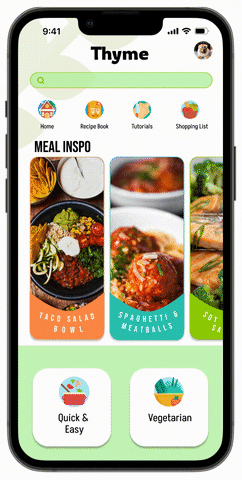
Video tutorials combined with simplified recipe captions were a key design focus to help users better visualize recipe steps and techniques, while also being more engaging than just reading a block of recipe text.
Additionally, there was a focus on using text that would speak to teens and young adults without sounding disingenuous.
A bright and bold color palette was used to create an energizing and fun design.
Testing & Improvements
After usability testing, I used the feedback to improve UX and UI functionality and implemented the following changes:
Once a recipe was viewed, there was no way of navigating back. In addition to a top navigation bar, I added a back button to let users return to a previous screen.
Some users found CTA navigation labels confusing, for example “Explore” and “My Recipes.” I changed the labels to be “Home” and “My Recipe Book” to clarify each page’s purpose.
There was also confusion around the lack of consistency, as both rectangle and square thumbnails were used to represent videos. For better consistency, I stuck to the rectangle thumbnail.

Results & Reflections
Challenges included creating a design that would incorporate aspects from existing apps that teens enjoy, such as Buzzfeed and TikTok, while retaining a unique vision and purpose and drafting interface and microcopy that teens would recognize without coming across as pandering. It was much more difficult than I initially thought, as Gen Z is all about authenticity. Another consideration was figuring out how to provide a pared back web experience that has enough of the app experience while still directing users to the app.